
Introduction to Stock Price Patterns
To successfully implement the buy on the upside strategy, you must know whether current prices are on the upside or the downside. This article discusses the most frequently occurring price patterns so you can recognize them as you monitor a real-time price series.
Knowing what to look for as prices change helps you make better-informed buy-and-sell decisions. Stock prices move up and down over time and these price movements have recognizable patterns. A price pattern describes how a stock, sector or market index changes over time.
The four basic price patterns are:
-
Rising prices (Upside)
-
Declining prices (Downside)
-
Sideways prices
-
Repeating cycles of increasing and decreasing prices
The following charts show examples of these four patterns. Each example plots historical prices over time. Also, some chart includes a trendline, which is a straight line that connects:
-
Significant lows of an increasing price series
-
Significant highs of a decreasing price series.
Therefore, prices fluctuate above and below the trendline.
To jump to a section in the article, click on a link.
Rising Prices
Declining Prices
Sideways Prices
Repeating Cyclical Prices
Topping Patterns
Sharp Top
Double Top
Multiple Top
Head and Shoulders Top
Bottoming Patterns
Rounding Bottom
Sharp Bottom
Double Bottom
Multiple Bottom
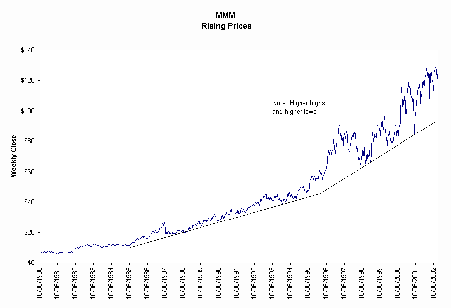
A rising price (upside) pattern has a general trend of increasing prices. The chart for 3M (MMM), a conglomerate, shows a long-term rising price pattern with two trendlines. As prices move higher, the short-term tops in price increase. Also the short-term lows that touch the trend line occur at higher prices. Therefore, the short-term highs and lows move higher for an increasing price pattern.
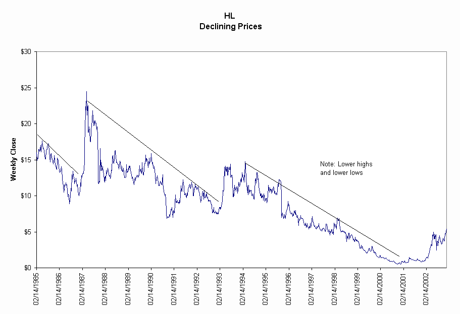
A declining price (downside) pattern is a trend of declining prices. The prices move up and down above the declining trend line. The chart for Hecla Mining (HL), a silver mining company, shows a long-term declining price pattern. The steep increase to $25 is an example of the volatile nature of price changes in silver- and gold-mining stocks. Also note as prices decrease the fluctuating short-term peaks become lower and the fluctuating short-term lows become lower. Lower highs and lower lows are characteristic of a decreasing price pattern.
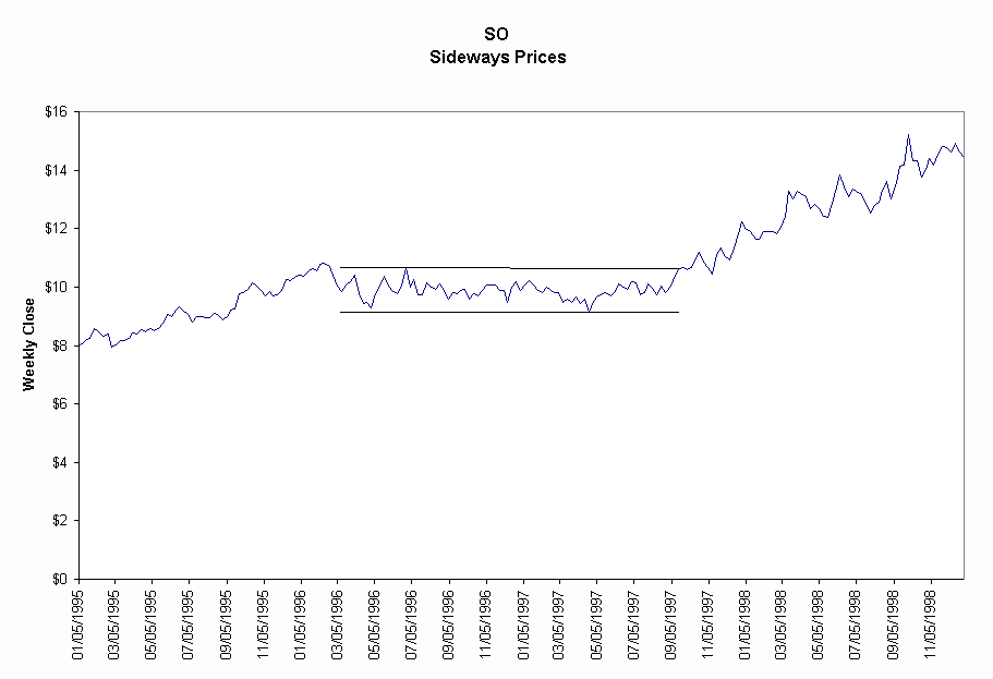
A sideways pattern is a trend of unchanging prices. The prices move up and down within two horizontal trend lines, which are defined by the high and low prices for the pattern. The horizontal patterns ends when prices form a rising or a declining pattern. The chart for Southern Company (SO), a larger electric utility, shows the horizontal price pattern that ends when prices form a rising pattern. Notice that prices fluctuate within the upper and lower price bands.
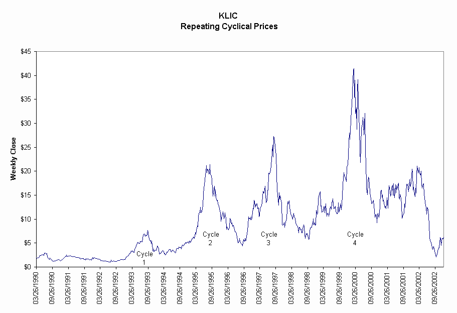
The next chart shows repeating cycles for Kulicke & Soffa (KLIC). Each of the four cycles has a well defined upside, a sharp peak and a downside of prices. This cyclical pattern repeats itself cycle after cycle. You can makes lots of money buying and selling on the upside of cyclical price patterns.
For more examples of cyclical price patterns click here.
Prices do not rise forever. The topping pattern is the end of the rising price pattern. When the topping process is complete, prices fall.
Four topping patterns are:
-
Sharp top
-
Double top
-
Multiple top
-
Head and Shoulders top
The following examples show the topping patterns.
Sharp Top
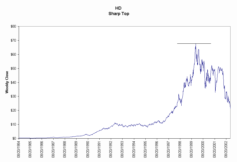
The sharp top of Home Depot (HD), the large home building supply store, is well defined by a steep and steady price rise. The initial down move from the top is also steep and steady. The sharp top clearly stands out from the prices preceding the sustained up move.
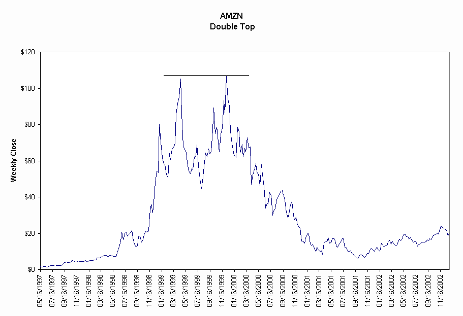
A double top has two tops of approximately the same price. Prices rise to a peak, fall and then rise a second time to the previous high. After the second peak prices fall. The chart for Amazom.com (AMZN), an Internet retailer, illustrates the double top.
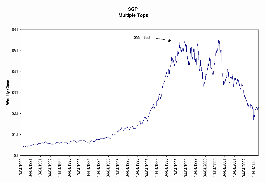
A multiple top has more than two tops of approximately the same price. The chart for Schering-Plough (SGP), a large pharmaceutical company, shows five tops between $53 and $55.
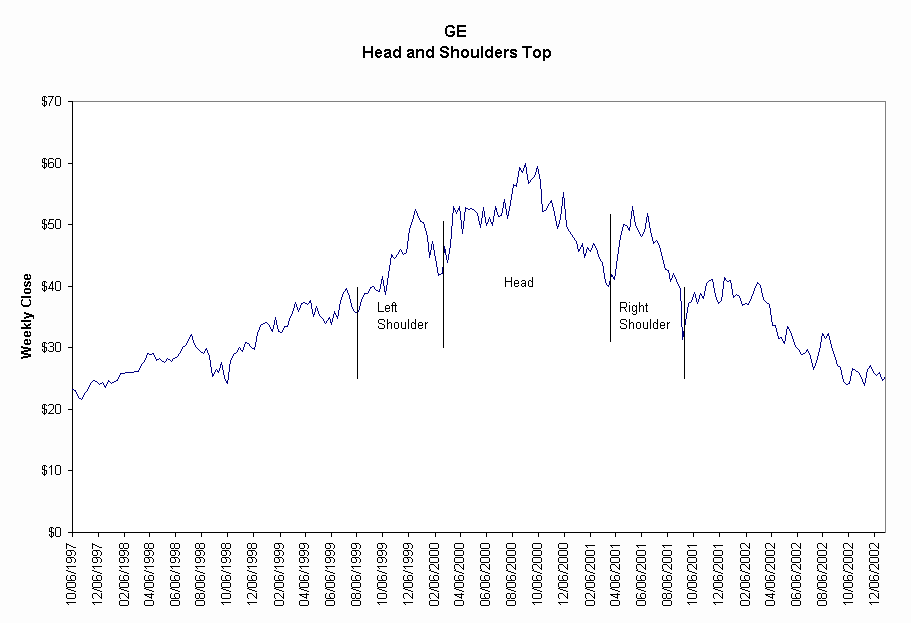
A head-and-shoulders top has three components: a temporary top followed by a higher top, which is followed by a lower temporary top. The first rise, top and decline is called the left shoulder. The second rise, highest top and decline is the head. The next rise, lower top and decline is the right shoulder. Prices continue to decline after the right shoulder.
The chart for General Electric (GE), the well-known conglomerate, shows a head and shoulders top price pattern.
A bottoming pattern is the end the declining price pattern. When the bottoming process is complete, prices obviously rise.
The bottoming patterns are:
-
Rounding bottom
-
Sharp bottom
-
Double bottom
-
Multiple bottom
The following examples show bottoming patterns.
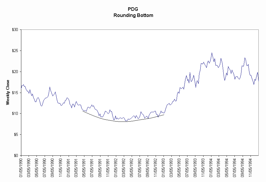
A rounding bottom is formed as prices decline gradually over time. Also, prices move off the bottom price slowly. Therefore, you don't know when the bottom price has occurred until well after the fact. The chart for Placer Dome (PDG), a gold mining stock, illustrates the price movement of a rounding bottom.
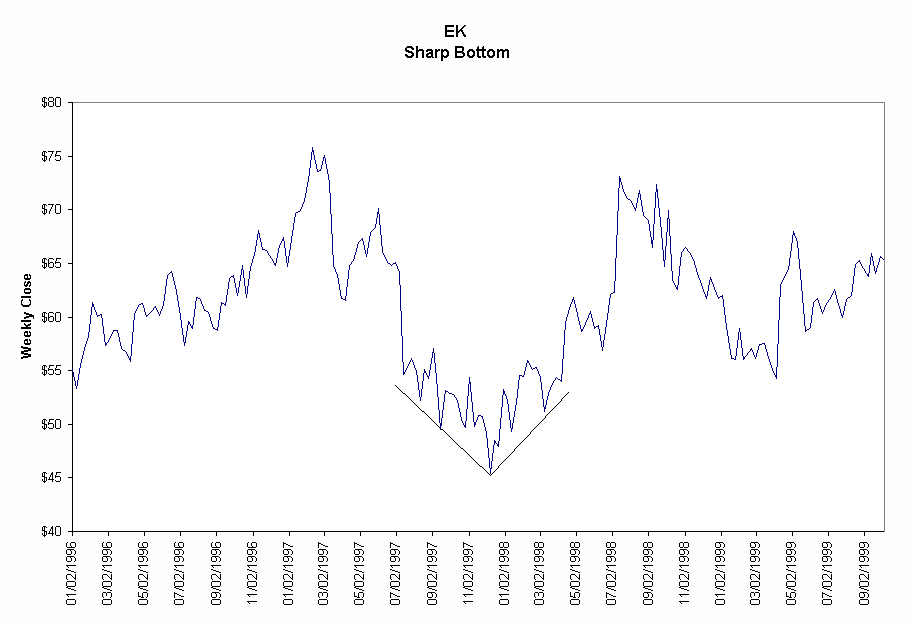
The sharp bottom is a well-defined end of declining prices. After the low price occurs, prices rise steadily. The sharp bottom for Eastman Kodak (EK), a photographic equipment manufacturer, is easily seen in the price chart.
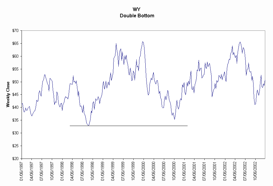
The double bottom has two lows that share the same values. After the second bottom, prices rise. The chart for Weyerheuser (WY), a timber and pulp grower, illustrates the double bottom.
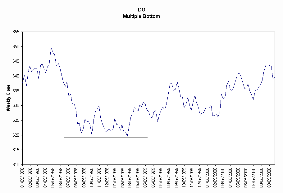
A multiple bottom consists of more than two low prices that are close in value. Prices rise after the last low price. Diamond Offshore (DO), an oil-drilling company, has three lows at $20.
Related Articles
Bottoming Price Pattern - Double Bottom
Bottoming Price Pattern - Reverse Head and Shoulders
Price Downsides Produce Losers
Topping Price Pattern - Bubble Top
Topping Price Pattern - Double Top
Topping Price Pattern - Head and Shoulders Top
Topping Price Pattern - Triple Top