3D Surface Chart of Returns: Upside Price Pattern for Take-Two Interactive Software
Investors and traders buy stocks on the price upside because most buy and sell combinations are profitable as prices rise.
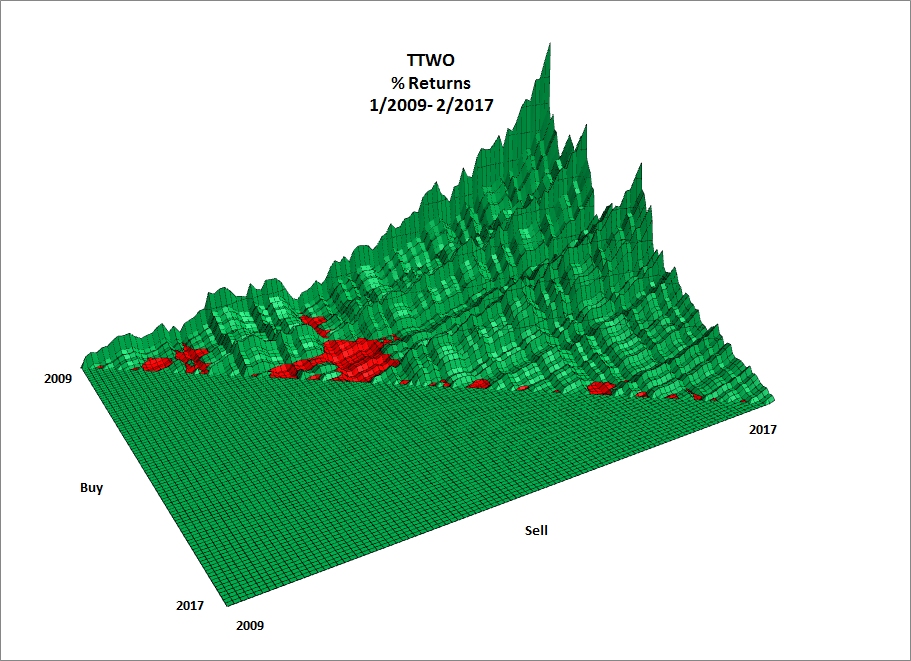
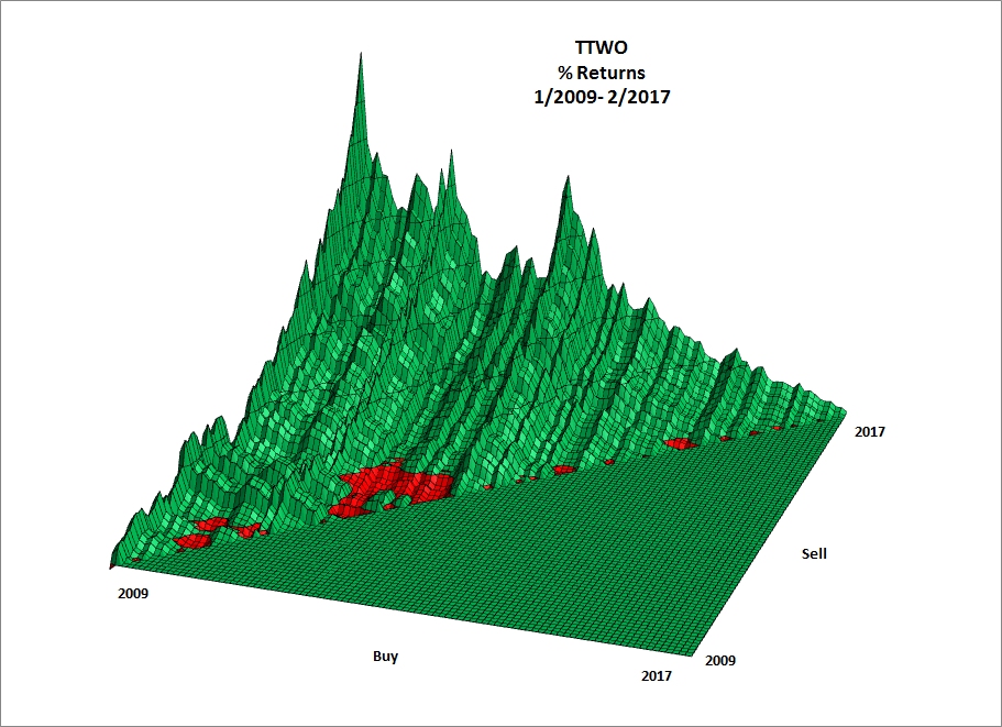
The following 3D surface chart for Take-Two Interactive Software (TTWO) displays the pattern of monthly percent returns for the 4,753 returns based on 98 monthly closes from January 2009 through February 2017, a period in which prices were on the upside. Prices peak on February 2017.
Each of the 4,308 (90.64%) profitable returns is shown in green and the 445 (9.36%) unprofitable returns are red. The preponderance of profitable returns given a large number buy and sell combinations shows why investing in stocks on the long-term price upside produces wealth.
Note: Each return is computed using its unique buy and sell date and prices where percent return = ((Sell price - Buy Price) / Buy Price) * 100.
Interpreting the 3D Chart
The buy axis runs from the back (2009) to the front (2017) on the left side of the chart. The sell axis runs from left (2009) to right (2017) along the front of the chart. The buy axis and the sell axis form the floor of the chart. No trades can occur in the flat green area because the buy date is after the sell date or the sell date is before the buy date. The pattern of positive returns (green) looks like a mountain range whose elevations are directly proportional to the magnitude of the percent returns. The negative returns (red) lie below the floor and appear as shallow scooped-out valleys. The back left corner of the chart is the return for the first buy price and its first sell price.
Returns for specific buy dates are displayed as slices that run from left to right across sell dates. Returns for specific sell dates are displayed as slices that run from front to back across buy dates.
Back Edge Returns
The back edge of the chart displays 97 monthly returns for the January 2009 buy date starting with the February 2009 sell date (back left corner) and ending with the February 2017 sell date (back right corner). Read the monthly returns from left to right. All returns are profitable (green). These returns mirror the price path from the start to the end of the price series. Returns peaked on February 2017 (back right corner) at 828%.
Right Edge Returns
The right edge of the chart displays 97 monthly returns for the February 2017 sell date starting with the January 2009 buy date return (back left corner) and ending with the January 2017 buy date return (front left corner). All returns are green for this slice. And most returns are green for other sell dates just prior to the peak date.
Buying at the Peak Returns
The largest area of unprofitable returns (red) located on the front left of the chart results from buying at relative high prices associated with the 2011 and 2012 intermediate peaks.
Numerous Small Red Areas
The small red areas along the diagonal of the flat area represent short-term unprofitable returns.

Another View

Related Articles
Stock 3d Percent Returns Chart Articles
3D Surface Chart of Returns: Bubble Price Pattern for Intel
3D Surface Chart of Returns: Cyclical Price Pattern for Lam Research
3D Surface Chart of Returns: Upside Downside Price Pattern for Chipotle Mexican Grill
3D Surface Chart of Returns: Upside Price Pattern for Amazon
Price Upsides Produce Profits
