
3D Surface Chart of Returns: Cyclical Price Pattern for Lam Research
Because most buy and sell combinations are profitable as prices rise, investors and traders buy cyclical stocks on the upside of the price cycle.
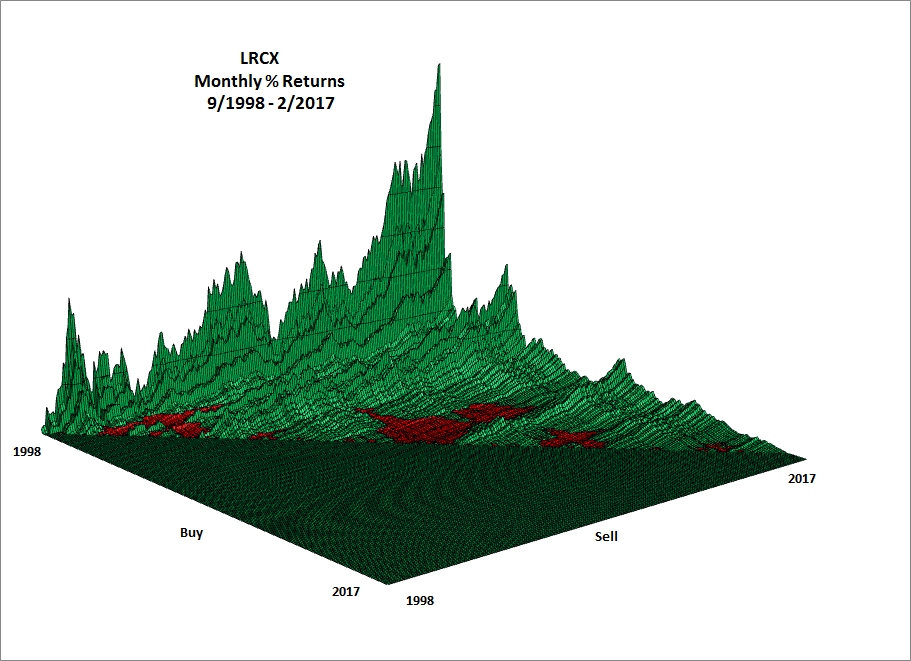
The first 3D surface chart below for Lam Research (LRCX) displays the pattern of monthly percent returns for the 24,531 returns based on 222 monthly closes from September 1998 through February 2017, a period of four distinct price cycles.
For the entire period, 19,933 (81.26%) of all returns were profitable (green) and 4,598 (18.74%) were unprofitable (red).
Note: Each return is computed using its unique buy and sell date and prices where percent return = ((Sell price - Buy Price) / Buy Price) * 100.
Interpreting the 3D Chart
The buy axis runs from the left (1998) to the right (2017) on the left side of the chart. The sell axis runs from left (1998) to right (2017) along the right side of the chart. The buy axis and the sell axis form the floor of the chart. No trades can occur in the flat green area because the buy date is after the sell date or the sell date is before the buy date. The pattern of positive returns (green) looks like a mountain range whose elevations are directly proportional to the magnitude of the percent returns. The negative returns (red) lie below the floor and appear as shallow scooped-out valleys. The red areas are associated with buying at relatively high prices and selling at lower prices. See the second 3D surface chart below for a discussion of red areas.
Returns for specific buy dates are displayed as slices that run from left to right across sell dates. Returns for specific sell dates are displayed as slices that run from left to right across buy dates.
First 3D Surface Chart of Returns
The slice of returns located in the very back left edge of the chart includes 221 returns, one return for each sell date given the January 1998 buy date. The highest return of the slice is 3,509% for the September 1998 buy date and February 2017 sell date. Because the September 1998 buy price is the lowest price of the entire price series, all returns for that buy date are profitable (green).
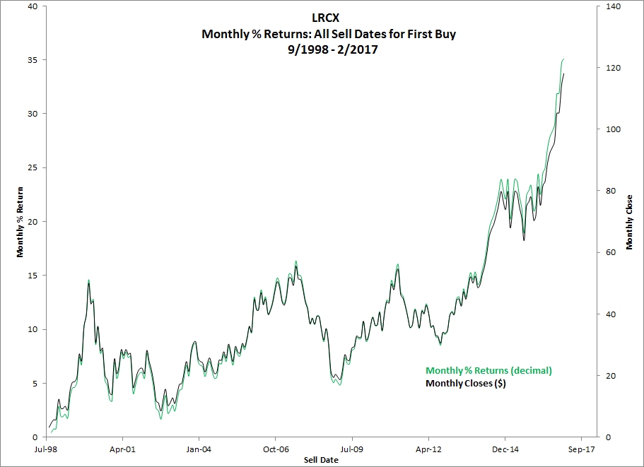
Pattern of Monthly Returns Corresponds to Monthly Closing Prices
The black solid curve represents the monthly closing prices from September 1998 through February 2017. The black green curve represents the monthly percent returns for the October 1998 through February 2017 sell dates given the September 1988 buy date. The returns are those shown on the back left edge of the previous 3D surface chart.
The returns mirror the price path from the start to the end of the price series. Note: returns are expressed in decimal form - for example, 35 means 3,500%.
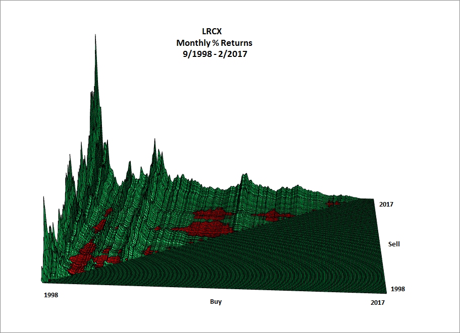
Second 3D Surface Chart of Returns
The back edge of returns for the next 3D surface chart of returns is oriented to display 221 monthly returns for the February 2017 sell date starting with the September 1998 buy date return (back left corner) and ending with the January 2017 buy date return (front right corner). All returns are profitable (green).
Red Areas
The areas of unprofitable returns (red) located on the chart result from buying at relative high prices associated with the price cycle tops. The red areas on the left side of the chart result from buying just before, at and just after the peaks in 1999 through 2001. The wider red areas in the center of the chart result from purchases made just before, at and just after the peak of July 2007. Buying around the March 2011 peak defines the red area to the right of the wide red area.
Ridges of Green Returns
The high ridge of green returns that runs from front to back to the right the first group of red areas results from buying at and around the September 2002 cyclical bottom. Other green ridges result from buying at prices dips and lows.
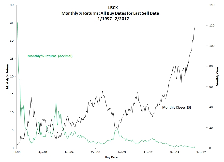
Relationship of Prices and Returns
The next chart shows the relationship of the monthly prices and percent returns for the last sell date on February 2017 and all buy dates.
The returns fluctuate inversely with their corresponding buy prices. LRCX prices follow a cyclical pattern, so the highest monthly returns result from buying at relatively low prices at the bottoms of price cycles. And buying at cycle tops results in relatively low returns.
The highest return (3,509%) results from the September 1998 buy date (lowest price in entire price series) and February 2017 sell date (highest price in entire price series).
Because the first closing price (September 1998) is the low of the price series and the last closing price (February 2017) is the high, returns for all buy prices are profitable for the February 2017 sell date.
As buy dates approach the final sell date, returns tend to decline because prices are closer to February 2107 closing price.
Related Articles
Stock 3d Percent Returns Chart Articles
3D Surface Chart of Returns: Bubble Price Pattern for Intel
3D Surface Chart of Returns: Upside Downside Price Pattern for Chipotle Mexican Grill
3D Surface Chart of Returns: Upside Price Pattern for Amazon
3D Surface Chart of Returns: Upside Price Pattern for Take-Two Interactive Software
Cyclical Price Pattern - An Opportunity to Make Money
Price Upsides Produce Profits